Why yarhp has click to load

When I need a break during the day I’d like to view an aggregated view of what the internet is talking about. To accomplish this I made a simple webapp called yarhp(Yet Another Redesigned HomePage). It’s simply a React app that fetches data from the Hacker News, GitHub, Producthunt, and reddit APIs and displays them in a single page. It’s not a groundbreaking design, nor is it innovative, but it works and I have full control over how it behaves.
At first, I set my new tab homepage to yarhp but noticed that it was easy to get distracted by immediately reading the top Hacker News headlines. After reading Make Time by Jake Knapp and John Zeratsky who spent time working on products at Google, I noticed that yarhp was falling into what they refer to as “infinity pools”.
Tools like this load data you’re likely to engage with right away and provide the user a way to infinitely page through content. These tools constantly evolve so that we keep using them day after day. This isn’t bad on its own, we chose to spend time using them so they must be accomplishing a job that we need done. The impact happens when that use comes at the expense of other productive activities.
Yarhp, was designed to fill the gaps when I needed to reset between productive activities. It was meant to take my commonly used aggregation lists and display them in a single place, ready for consumption, so I could spend a set amount of time (maybe the 5 minutes between pomodoros) browsing new and exciting things. However, I noticed that I had to intentionally try not to engage with yarhp when I opened a new tab during productive times and instead had to push through to wherever I was going.
At the same time I was getting irritated by the amount of time I spent scrolling through reddit with little return during my off time. When I was bored I’d open my phone, tap the reddit icon, and start scrolling. After stepping back I realized the content on HN is higher quality and more actionable, when I wanted to see a certain class of memes I’d manually go to a subreddit, and hearing news slightly later but with better data via NYTimes push notifications didn’t leave me feeling “left out”. I decided I was going to spend less time mindlessly scrolling and try to break the muscle memory of: bored -> open reddit; so I uninstalled the mobile app from my phone and decided I’d put more barriers between me and my “infinity pools”.
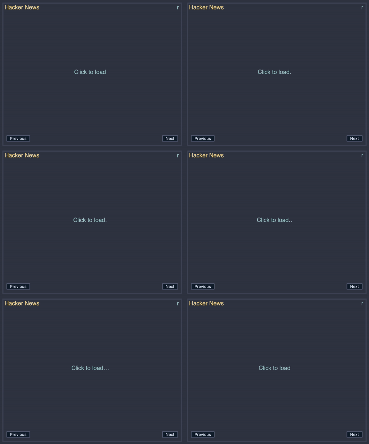
Initially, yarhp simply took reddit’s place as it would immediately load and I could click “Next” infinitely. I wanted to give myself a second chance before actually jumping down a rabbit hole. Thus, I added “Click to load…” on every panel in yarhp so that, for each of the sources, I’d have to click the panel to fetch the stories. This appears to have helped greatly but I’m worried that it’ll become yet another piece of muscle memory that doesn’t really get in between me and the infinity pool.
Going forward I think I’d like to make a couple tweaks/experiments with yarhp:
- Instead of having to set my new tab to
about:blankwhat if, once I engage with yarhp it saves the time in local storage, and prevents the app from loading until 15 minutes after the engagement? This would act as a cool down period between dips in the “infinity pool”. - Rate-limit the link loading so that it takes 20-30 seconds for all of the links to render on the page. Rather than having all of the top posts right away, having to wait a couple seconds per link would slow me down and maybe drive to more productive things.